Glazed Donuts - Logo, Packaging
Glazed Donuts is a fictitious donut food truck. The company needed a logo, a truck design, and designs for various packaging.
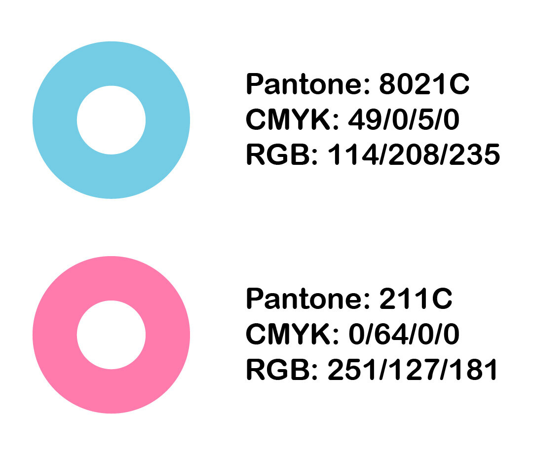
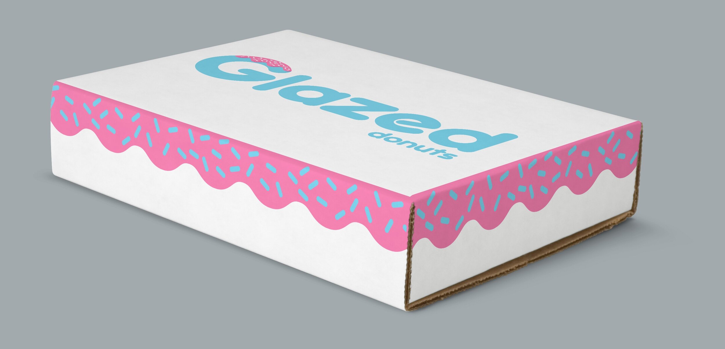
The logo was designed to make the G in Glazed look like a donut with frosting and sprinkles. It has a fun and cartoony look and will appeal to anyone looking for a quick donut at the local Off the Grid. The typography consists of bold letters that are quite rounded to match the shape of donuts. The color scheme consists of light blue and pink - colors that give a light and happy vibe while also making the G actually look appetizing.
The frosting and sprinkles feature of the logo is used throughout the brand and clearly ties everything together. It is used on the hood of the truck and around the top edges of the donut bag, donut box, and coffee cup. The bag, box, and coffee cup will all be served out of the truck and all the pieces will be easily recognizable.
The execution of this project is not for profit, this is a school project (UC Berkeley Ext.) that was assigned in order for me to develop design skills in terms of re–branding and packaging.